Data Engineering Vendor Scorecard Template (Free Download)
You’re probably in the middle of this right now. Two consultancies looked sharp in the intro call. One brought impressive Snowflake and dbt credentials. Another promised a faster team, lower cost, and “senior architects on every workstream.” Procurement wants apples-to-apples scoring. Your engineers want a technical deep dive. Finance wants a defensible recommendation.
At this stage, vendor selection usually goes sideways.
The failure rarely starts with bad intentions. It starts when stakeholders score vendors from memory, meetings, and presentation polish. The loudest person in the room fills in the blanks. Then six months later, your internal team is fixing brittle Airflow jobs, arguing over change requests, and explaining why the migration timeline slipped.
A data engineering vendor scorecard template fixes that. It turns a fuzzy selection process into a decision system.
Choosing a Data Engineering Partner Is a High-Stakes Decision
A data engineering consultancy doesn’t just deliver tickets. It shapes your platform, your operating model, and the reliability of the pipelines your business runs on. If they get architecture wrong, you inherit the mess. If they staff weakly, your team absorbs the rework. If they oversell tool expertise, your roadmap stalls.
That’s why I treat vendor selection as risk management first, procurement second.

Structured scorecards work because they force evidence into the process. Organizations implementing structured vendor scorecards report a 15-25% reduction in supply chain risks, according to vendor management best-practice analysis. For data engineering leaders, the same principle holds. Define the criteria, weight them properly, and stop letting charisma outrank capability.
What usually goes wrong
Most failed selections follow a predictable pattern:
- Overweighting demos. A polished architecture walkthrough says little about delivery discipline.
- Underweighting staffing reality. You meet senior people in the pitch, then get handed a mixed bench after signature.
- Confusing partner badges with execution quality. Databricks, Snowflake, AWS, and dbt partnerships matter. They don’t replace proof.
- Treating price as strategy. The cheapest bid often becomes the most expensive project to unwind.
Practical rule: If your evaluation process can’t explain why Vendor B beat Vendor A without referencing “gut feel,” your process is broken.
What the scorecard changes
A good scorecard doesn’t make the decision for you. It makes weak decisions harder to justify.
Use it before the first technical workshop. Use it during the RFP. Use it again after references and solution reviews. The result is a documented trail that survives procurement scrutiny and executive review.
If you need a parallel workstream for the non-scorecard checks, use this data engineering due diligence checklist. Keep the scorecard focused on evaluation. Keep due diligence focused on validation.
Our Eight-Factor Data Engineering Scoring Methodology
Most vendor templates online are generic. They work for office supplies, not for a consultancy designing your ingestion framework, data model, orchestration layer, governance controls, and migration plan.
My recommendation is an eight-factor model tuned for data engineering consulting. It aligns with the weighted methodology used in market evaluations of consultancies and keeps the scoring anchored in evidence. According to the vendor scorecard guidance summarized in Smartsheet’s methodology overview, scorecards should use quantifiable equations such as “Rolling Quarterly Quantity Rejected ÷ Rolling Quarterly Quantity Delivered” to support consistent, evidence-based comparisons. The same discipline belongs in data engineering selection.
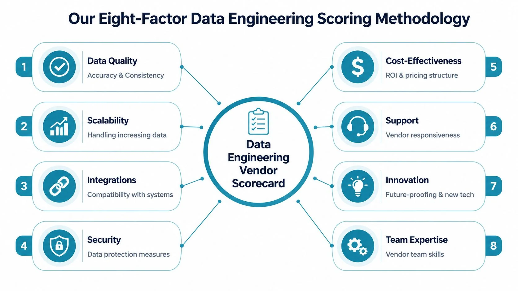
The scorecard table
| Evaluation Factor | Default Weight | Description | Sample KPIs |
|---|---|---|---|
| Technical Expertise | 30% | Depth in core platforms and architecture patterns | Snowflake or Databricks delivery history, dbt design quality, Airflow orchestration maturity, cloud platform fluency |
| Delivery Quality | 20% | Ability to execute cleanly and predictably | Milestone reliability, defect handling, documentation quality, handoff readiness |
| Industry Experience | 15% | Familiarity with domain constraints | Governance requirements, regulated data handling, domain-specific modeling patterns |
| Cost-Effectiveness | 10% | Commercial fit relative to scope and risk | Clarity of rates, change request discipline, staffing mix, TCO alignment |
| Scalability | 10% | Ability to support current and future platform needs | Batch and streaming design, throughput planning, environment promotion strategy |
| Market Focus | 5% | Relevance of the firm’s core business to your problem | Whether data engineering is a true practice or a side offering |
| Innovation | 5% | Practical thinking on modern patterns | Data contracts, observability, platform automation, AI/ML pipeline readiness |
| Support | 5% | Responsiveness and operational maturity | Post-launch support model, incident response posture, documentation and training |
Technical expertise gets the heaviest weight
If a consultancy can’t design dependable ingestion, transformation, orchestration, and warehouse patterns, nothing else matters. This factor should carry the most weight in most projects.
For Snowflake work, I look for schema design judgment, dbt testing discipline, workload isolation thinking, and cost-aware warehouse setup. For Databricks, I care about Delta design, job orchestration, environment promotion, and production discipline. For AWS, Azure, or BigQuery projects, I want proof they understand the cloud-native pieces around the platform, not just the headline tool.
According to DataEngineeringCompanies.com’s analysis of 86 data engineering firms, the firms that stand out usually show repeatable platform specialization rather than broad “we do everything” positioning. That’s the signal to reward.
Delivery quality separates consultants from slideware
A lot of vendors can architect. Fewer can deliver week after week.
This category should capture whether the firm produces stable work products, manages risks early, and leaves behind a maintainable platform. Ask for issue logs, sample runbooks, test strategy examples, and project governance artifacts. Don’t accept a generic PMO answer.
A consultancy that “moves fast” but leaves your team with undocumented DAG logic and inconsistent dbt conventions hasn’t delivered. It has externalized the cleanup cost.
Industry experience matters when constraints are real
Healthcare, fintech, retail, and enterprise modernization all impose different demands. A vendor that understands HIPAA-sensitive workflows, auditability, PII boundaries, finance-grade reconciliation, or omnichannel data models will ramp faster and make fewer architecture mistakes.
I don’t give this factor top billing unless the domain is heavily constrained. But when it matters, it matters a lot.
Cost-effectiveness is not the same as low rates
Many teams frequently get lazy. They compare day rates and call it commercial analysis.
Bad move.
You want the vendor whose proposed team, scope control, and operating style produce the best outcome for the money. Expensive senior talent can be cheaper than a larger mid-level team that burns time in rework. A “competitive” proposal with vague assumptions is often the most dangerous bid in the stack.
Scalability tells you whether the platform survives success
Some firms build for the pilot. Better firms build for production.
Scalability in a data engineering context means they can design pipelines, storage patterns, orchestration, and permissions that won’t collapse when sources increase, workloads multiply, or business units pile on. In interviews, ask how they’d evolve the architecture after launch. Weak vendors answer only for the current scope.
Market focus, innovation, and support are smaller but decisive
These don’t need massive weights, but they should stay in the model because they break ties and expose hidden risk.
- Market focus helps you avoid generalist firms with a thin data practice.
- Innovation shows whether the team thinks in modern terms like observability, data contracts, CI/CD for analytics engineering, and governance by design.
- Support tells you what happens after go-live, when your internal team starts owning the platform.
Getting Started With Your Scorecard Template
The first draft is often overcomplicated. Don’t. Start with one spreadsheet, one scoring scale, and one evidence standard.

The template should have four tabs:
- Instructions for scale definitions and scoring rules
- Main scorecard where evaluators enter vendor scores
- Evidence log with links to proposals, demo notes, references, and contract assumptions
- Dashboard that ranks vendors and visualizes strengths and weaknesses
Use weighted scoring, not average scoring
Weighted scoring reflects reality. Not every criterion deserves equal influence.
A rigorous method starts by defining supplier tiers and assigning tier-specific KPIs and weightings. Firms using that approach report a 25-35% improvement in vendor performance, according to Ivalua’s vendor scorecard methodology summary. For data engineering consulting, the same discipline keeps a flashy low-priority feature from outranking technical competence.
The core formula is simple:
- Weighted score per criterion = raw score × weight
- Total score = sum of all weighted scores
- Normalized score = weighted total adjusted to your scoring scale
If you’re building this in Excel or Google Sheets, SUMPRODUCT is the right function for the total weighted result. That gives you transparent math and makes audit conversations easy.
Keep the scoring scale brutally clear
Use a 1 to 5 scale with written definitions. Don’t leave interpretation open.
A practical version:
- 5 = exceeds requirements with strong evidence
- 4 = meets requirements with minor gaps
- 3 = acceptable but carries visible risk
- 2 = weak evidence or meaningful concerns
- 1 = unacceptable
If you’re also evaluating firms from a broader transaction lens, these top PE due diligence resources are useful for pressure-testing commercial and operational assumptions around the project.
A quick walkthrough helps teams adopt the spreadsheet faster:
Fill the template in this order
Don’t start by scoring. Start by locking the rules.
- Set the project type. Snowflake migration, Databricks platform build, dbt modernization, Airflow remediation, governance rollout.
- Assign weights once. Do this with engineering, platform, security, and procurement in the room.
- Define evidence sources. Proposal, workshop, demo, references, partner directory, staffing matrix.
- Score independently first. Then compare evaluator differences.
- Resolve only with evidence. If nobody can point to evidence, the score should drop.
One practical option for vendor research input is DataEngineeringCompanies.com, which publishes firm profiles, verified capabilities, platform focus, team size information, and methodology-based rankings that can help populate your longlist before formal scoring begins.
How to Customize Criteria and Weights For Your Project
A generic template is a starting point, not a decision system. Your project should reshape the scorecard.
The cleanest way to do that is to keep the eight top-level factors and customize the sub-criteria under them. That preserves consistency while adapting to the work at hand.
For platform migrations, bias toward quality and delivery
If you’re moving from legacy SQL Server, Hadoop, Redshift, or on-prem ETL into Snowflake, Databricks, or BigQuery, execution discipline matters more than novelty.
A practical benchmark for data engineering scorecards is to emphasize Quality (40% weight), Delivery (25%), and Cost-effectiveness (15%), with domain KPIs such as defect rate per pipeline run, on-time delivery above 99%, and TCO variance below 5% from RFP, as outlined in this IT vendor scorecard template adapted for data engineering.
For this type of work, I add sub-criteria like:
- Cutover readiness tied to rollback planning and validation completeness
- Testing rigor across source-to-target reconciliation and transformation logic
- Documentation quality for runbooks, lineage, and operating procedures
- Dependency handling for upstream systems and business acceptance windows
For greenfield platforms, overweight architecture judgment
A net-new platform build needs different emphasis. You’re not just buying implementation capacity. You’re buying decisions that shape the next few years.
Increase weight inside Technical Expertise, Scalability, and Innovation. Then ask questions that force architectural tradeoffs into the open:
- Why Snowflake over Databricks for this workload mix?
- Why dbt for transformation versus heavier orchestration in Airflow?
- What belongs in streaming now, and what should stay batch?
- How will governance work before the catalog and policy layer is mature?
Don’t reward vendors for having an opinion. Reward them for defending tradeoffs clearly and changing recommendations when your constraints demand it.
For regulated environments, security and governance move up
If the engagement touches healthcare, fintech, or public-sector-adjacent data, bake governance and security into the existing factors rather than creating a disconnected “miscellaneous” bucket.
That means raising the weight of sub-criteria under Industry Experience, Delivery Quality, and Support. I’d score heavily on auditability, access control design, data retention handling, and incident communication.
If you also operate in procurement-heavy environments, this guide to UK public sector bids is useful for thinking about how formal evaluation criteria should be documented and justified.
A simple customization checklist
Before scoring any vendor, answer these four questions:
- What breaks the project fastest. Bad architecture, weak migration discipline, poor governance, or bad support?
- What is hardest to fix later. Tool choice, data model, permissions design, or operating model?
- Where is internal capability weakest. Staff augmentation can fill gaps. It can’t fix unclear ownership.
- Which mistakes are politically expensive. Compliance misses and failed cutovers usually outrank a modest cost overrun.
Applying the Scorecard in RFPs and Live Evaluations
The spreadsheet is not the process. It supports the process.
Use the scorecard as an internal evaluation instrument, not as a form you hand to vendors. Vendors should respond to requirements, architecture prompts, staffing requests, and commercial questions. Your team then maps those responses into the scorecard.
If your procurement team needs a plain-English reference for terminology, this short RFP definition is a useful baseline. For the operating process around your own vendor review cycle, use these RFP process best practices.
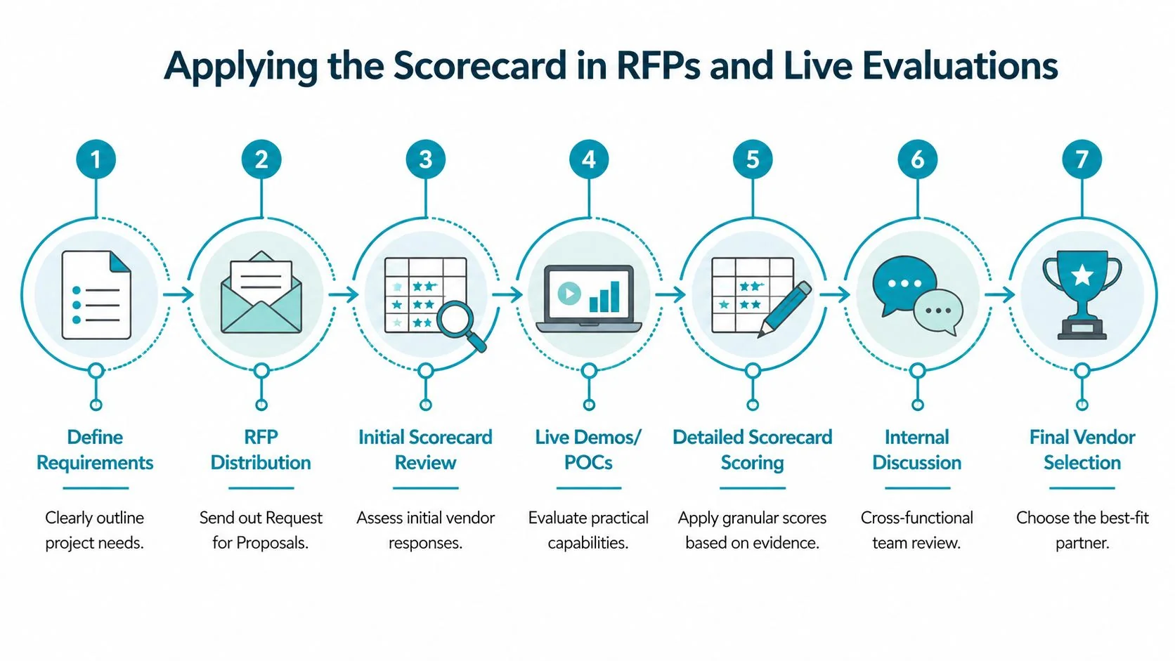
How the live evaluation should run
I use a seven-part flow:
- Define requirements with enough detail to expose tradeoffs
- Issue the RFP with architecture, staffing, and support questions
- Shortlist on paper before any live sessions
- Run technical deep dives with the actual proposed delivery leads
- Score references separately from pitch meetings
- Reconcile evaluator differences using evidence only
- Present the final recommendation with score, rationale, and risks
Worked example with two fictional vendors
You’re selecting a partner for a Snowflake and dbt modernization on AWS.
Vendor A submits a lower-cost proposal. Their slides look polished. The team in the pitch speaks well, but the proposed staffing model leans heavily on general cloud engineers. In the deep dive, they answer dbt questions at a surface level and rely on generic migration language. Their support model after go-live sounds thin.
Vendor B is more expensive. Their proposal includes named platform specialists, a clearer testing approach, and stronger thinking on environment design, CI/CD, and handoff. In references, they get specific about issue resolution and documentation discipline.
A simple outcome table might look like this:
| Factor | Vendor A | Vendor B | What drove the difference |
|---|---|---|---|
| Technical Expertise | Lower | Higher | Stronger Snowflake, dbt, and AWS depth from Vendor B |
| Delivery Quality | Lower | Higher | Better migration plan and operating artifacts from Vendor B |
| Industry Experience | Similar | Similar | Both have relevant enterprise examples |
| Cost-Effectiveness | Higher | Moderate | Vendor A is cheaper on paper |
| Scalability | Lower | Higher | Vendor B showed better future-state platform thinking |
| Market Focus | Moderate | Higher | Vendor B is more specialized in data engineering |
| Innovation | Lower | Higher | Better observability and CI/CD patterns from Vendor B |
| Support | Lower | Higher | Vendor B had a clearer post-launch model |
The point isn’t the labels. The point is what they reveal. Vendor A wins on initial price. Vendor B wins on the things that protect the project.
If a vendor scores lower on cost but materially higher on architecture, delivery, and support, that’s usually the safer and cheaper decision over the life of the engagement.
What to collect before final scoring
Don’t finalize the scorecard until you’ve gathered all of this:
- Named team structure with roles matched to workstreams
- Architecture response that shows decisions, not recycled diagrams
- Delivery plan with testing, cutover, and handoff assumptions
- Reference calls focused on issues, not just satisfaction
- Commercial assumptions including what triggers change requests
Many teams make their real mistake here. They score too early.
Beyond the Score Exporting Results for Executive Buy-In
The selection isn’t done when the team agrees. It’s done when the decision survives executive review.
Your scorecard output should produce three artifacts for leadership:
- A one-page vendor comparison
- A risk summary
- A recommendation memo with decision rationale

Show shape, not just totals
A single final score is useful, but it hides tradeoffs. Executives need to see where each vendor is strong, weak, and risky.
Use visuals that make those differences obvious:
- Radar chart for the eight factors
- Heat map for evaluator consensus and disagreement
- Bar chart for total weighted score
- Short narrative on why the winning vendor fits the project
Translate technical judgment into business language
Don’t say, “Vendor B had better orchestration design.”
Say, “Vendor B reduced implementation risk because they showed stronger delivery control, clearer handoff documentation, and better platform scaling logic.”
That’s what finance, procurement, and the executive team need. They don’t need every technical detail. They need a defensible connection between evaluation evidence and business risk.
The strongest recommendation memo doesn’t argue that the selected vendor is perfect. It argues that the alternatives carry more material risk in the areas that matter most.
Your next move after scoring should be simple. Turn the spreadsheet into an approval pack, confirm commercial assumptions, and lock the governance model before signature.
Frequently Asked Questions About Vendor Scorecards
How do I score subjective criteria without turning the exercise into opinion?
Use proxy evidence. For innovation, score the quality of proposed automation patterns, observability approach, and roadmap fit. For support, score documented escalation paths, training materials, and post-launch operating model. Subjective categories become manageable when you define what evidence counts before reviews start.
What if a vendor won’t provide enough information?
Score the gap, not the promise. If a consultancy can’t show staffing clarity, referenceable delivery evidence, or a concrete architecture response, mark that as risk. Don’t fill missing data with optimistic assumptions.
Should I use the same scorecard for selection and ongoing vendor management?
Use the same top-level factors, but change the evidence. During selection, you score proposals, demos, references, and staffing. After award, you score actual delivery behavior, quality of artifacts, issue handling, and support performance.
How often should we re-evaluate an incumbent consultancy?
Tie the cadence to project phase and risk. During active migrations or platform builds, review frequently enough to catch delivery slippage early. For stable managed support arrangements, a lighter recurring review works. The point is consistency and evidence, not calendar theater.
Can this work for smaller projects?
Yes, but simplify it. Keep the eight factors if you want continuity, then reduce the number of sub-criteria and the number of evaluators. The mistake on smaller projects is skipping rigor entirely. Even a lean scorecard beats a Slack-thread decision.
What’s the biggest scoring mistake teams make?
They confuse low price with low risk.
That error shows up everywhere. A cheaper vendor often scores well on commercials and poorly on the categories that determine whether the project lands cleanly. If your scorecard doesn’t make that tradeoff visible, it isn’t doing its job.
Use the template, force evidence into every score, and make the final recommendation in plain language. That’s how you avoid buying a slick presentation instead of a capable data engineering partner.
Data-driven market researcher with 20+ years in market research and 10+ years helping software agencies and IT organizations make evidence-based decisions. Former market research analyst at Aviva Investors and Credit Suisse.
Previously: Aviva Investors · Credit Suisse · Brainhub · 100Signals
Top Data Engineering Partners
Vetted experts who can help you implement what you just read.
Related Analysis
Data Engineering Staff Augmentation: A 2026 Playbook
Your authoritative guide to data engineering staff augmentation. Learn when to use it, how to vet vendors, benchmark rates, and manage engagements for max ROI.
Top 7 Places to Find Data Engineering Service providers in 2026
Discover the 7 best places to find and evaluate data engineering service providers. Get practical, no-fluff insights to select the right partner in 2026.
Data Lakehouse vs Data Mesh: A 2026 Decision Guide
Choose the right architecture for your enterprise. A detailed comparison of data lakehouse vs data mesh on cost, governance, performance, and vendor selection.