Best Data Visualization Software: Top Tools for 2026

Your BI tool choice is a data platform decision. Tableau reported processing over 10 billion data rows daily in 2024, which shows how central BI has become to enterprise operations, not just dashboard delivery. If the tool sits poorly on top of Snowflake, Databricks, or BigQuery, you pay for it twice: once in license overhead, and again in duplicated logic, weak governance, and warehouse spend that no one owns.
That’s why the best data visualization software isn’t the one with the prettiest charts. It’s the one that fits your data platform, enforces consistent metrics, and scales without turning every dashboard refresh into an engineering ticket. If you’re also revisiting infrastructure choices under the stack, this Continuum Solutions cloud hosting advice is a useful parallel read.
For CTOs and Heads of Data, the shortlist is straightforward. Start with platform fit, governance model, and total cost of ownership. Then pick the tool that matches how your teams build and consume data products.
1. Microsoft Power BI
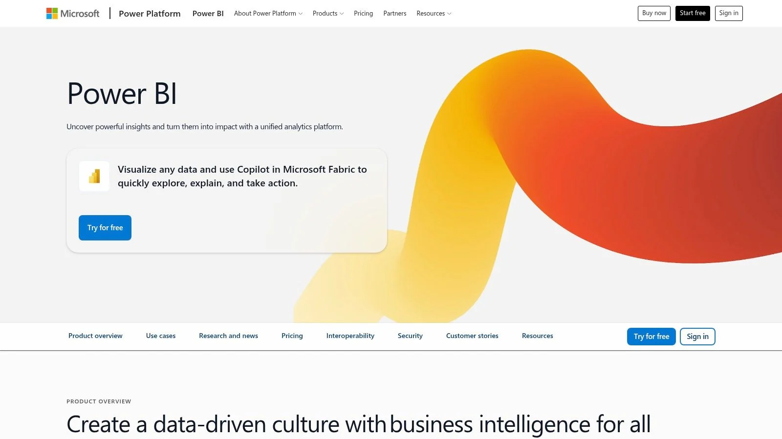
Power BI is the default recommendation for Microsoft-centric enterprises. If your stack already runs on Azure, Microsoft 365, Teams, Excel, and Fabric, anything else adds friction you don’t need.
Asapp Studio ranked Power BI as the best value option in its 2025 expert guide, and Microsoft says pricing starts at $10 per user/month for Pro licenses. That matters because BI cost rarely stops at licenses. It expands through sharing rules, capacity planning, and the number of people who need governed access to production data.
Where It Wins
Power BI works well when you want a governed self-serve model without abandoning centralized control. Semantic models, row-level security, embedded analytics, paginated reports, and tight Fabric alignment make it practical for mixed workloads.
For Azure-native teams, this is the cleanest path to an integrated reporting stack. If you’re building around Synapse, Fabric, or a broader Microsoft estate, you can find Azure data engineering solutions that align the warehouse, orchestration, and BI layers instead of treating reporting as a bolt-on.
Practical rule: Choose Power BI when identity, access, and collaboration already run through Microsoft. You’ll reduce implementation drag faster than you’ll gain visual finesse elsewhere.
The tradeoff is operational. Sharing at scale often pushes you into paid capacity decisions, and Fabric sizing gets more complex as usage spreads across analytics, notebooks, and pipelines. Power BI is strongest when one team owns that architecture centrally.
2. Tableau
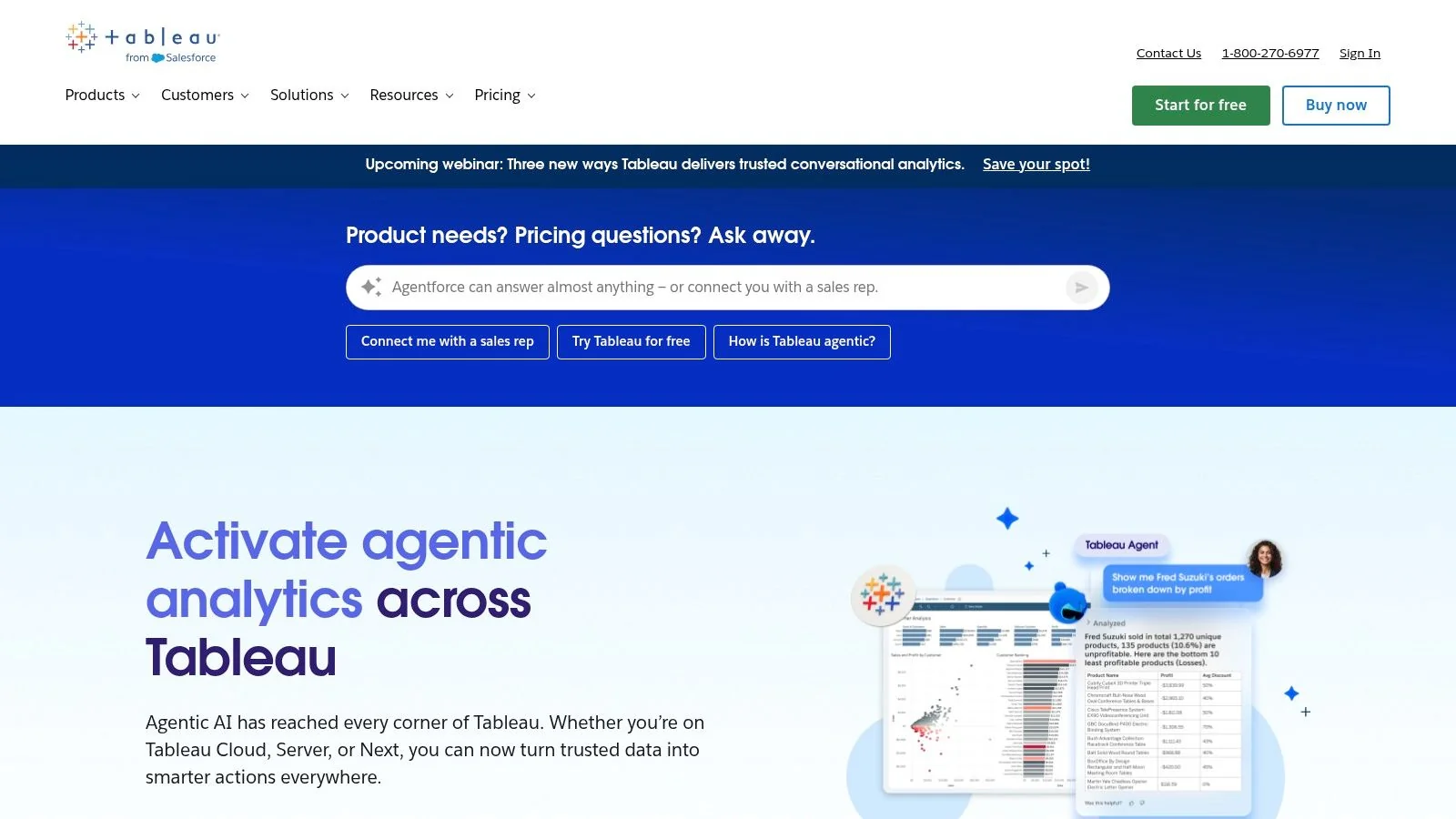
Tableau is the best choice when your BI layer must deliver polished, executive-ready analytics without compromising enterprise deployment control. If your team already runs a modern cloud data stack and needs a presentation-grade front end on top of it, Tableau still sets the standard.
From a data platform perspective, Tableau works best as the consumption layer, not the place where business logic lives. It connects cleanly to Snowflake, Databricks, and BigQuery, and its authoring experience still drives strong analyst adoption. Keep transformations, metric definitions, and access policy logic upstream in dbt, your warehouse, or your lakehouse. That lowers governance risk and makes migrations less painful later.
This is also where cost and operating model matter. Tableau can scale across large, distributed teams, but it requires tighter license management and stronger content governance than tools built around a single centralized semantic layer. If you let every team publish its own logic, duplicate metrics and dashboard sprawl show up fast.
Tableau Prep is useful for analyst workflows. It should not become your production data pipeline.
If your priority is visual quality, flexible deployment, and broad analyst self-service on top of governed cloud data platforms, Tableau is a strong pick. If your priority is minimizing semantic drift and controlling total cost with a smaller BI admin footprint, scrutinize the alternatives early. This review of top Tableau software competitors is a useful secondary scan.
Choose Tableau when you want the strongest visual experience on top of Snowflake or Databricks and you have the data governance discipline to keep logic out of the BI layer.
3. Qlik Sense
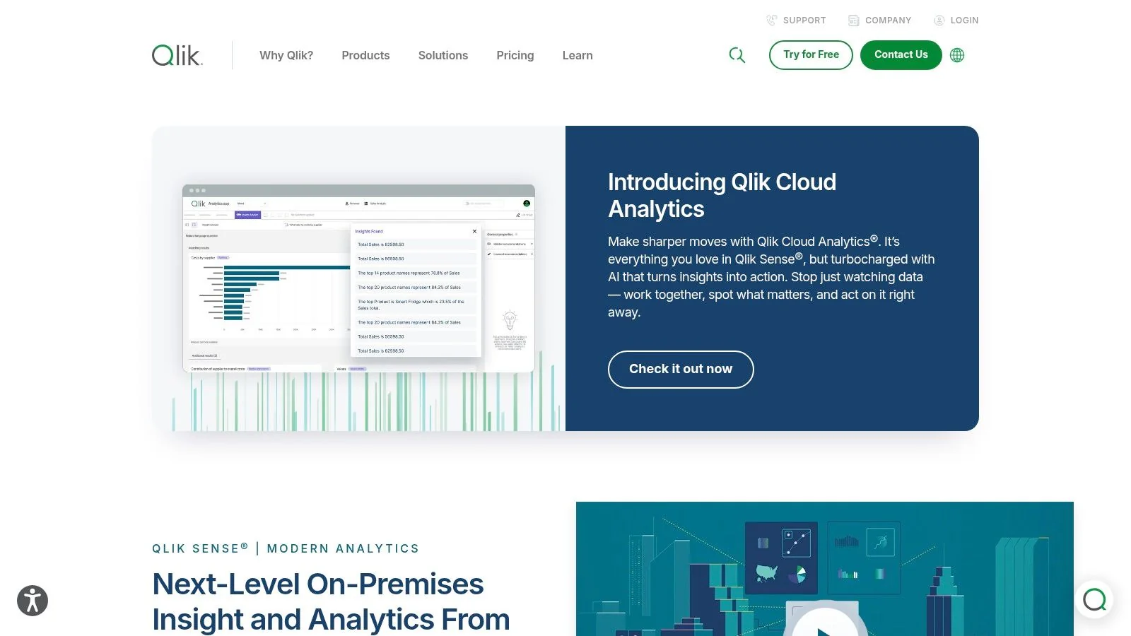
Qlik Sense is for teams that explore across messy, blended, multi-source data and don’t want every analysis path constrained by a rigid dashboard model. Its associative engine is still its defining advantage.
That makes Qlik useful in enterprise environments where the warehouse isn’t the whole story yet. If you’re in a migration phase, or if multiple business units still rely on mixed operational sources, Qlik can bridge that gap better than warehouse-only BI patterns.
What CTOs Should Watch
Qlik Cloud and client-managed deployment options give architecture flexibility. That’s valuable if data residency, tenancy, or internal hosting requirements still shape your BI choices.
The tradeoff is governance complexity. Qlik can absolutely operate in governed enterprise environments, but it needs deliberate ownership. Without a strong semantic and access model upstream, associative exploration can expose inconsistency faster than it creates trust.
- Choose Qlik Sense when users need to discover relationships across blended datasets without waiting for every question to be modeled first.
- Avoid it as your default when your priority is a simple, opinionated, SaaS-first governance model with minimal admin overhead.
Qlik is strong in transitional architectures. It’s less attractive when your operating model demands strict, centrally managed metric definitions from day one.
4. Looker
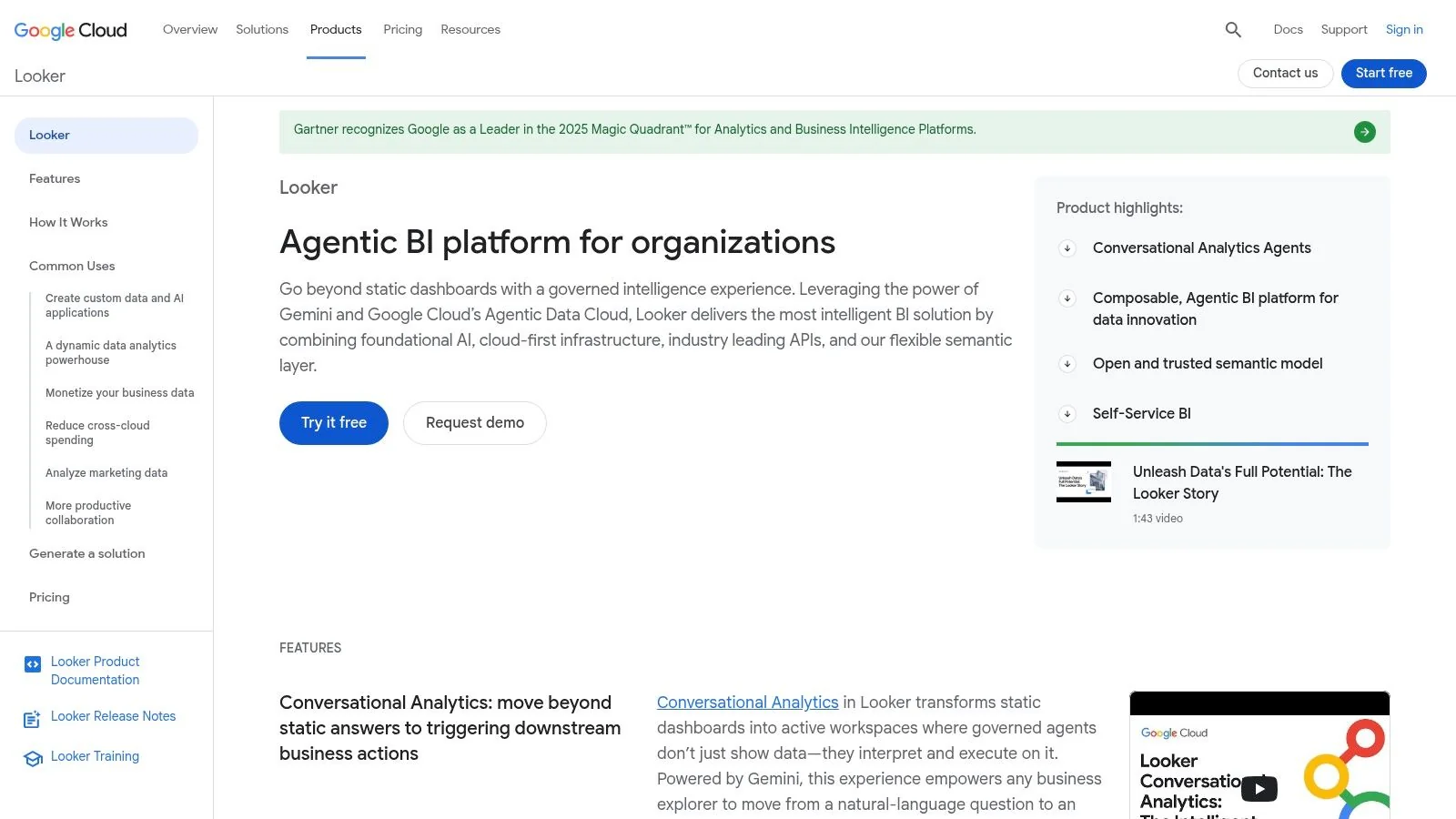
Looker is the best choice when governed metrics matter more than drag-and-drop speed. If your BI problems come from inconsistent definitions, duplicated SQL, and dashboard sprawl, Looker fixes the root issue instead of decorating it.
LookML forces modeling discipline. That creates more setup work, but it also creates a durable semantic layer that can support dashboards, embedded analytics, and downstream consumption without constant rewrites.
Strongest in Governed GCP Environments
Looker fits naturally with BigQuery and broader Google Cloud estates. It also works well in multi-cloud stacks where your data team wants metric logic versioned and reviewed like code. That’s a better operating model than burying business definitions inside report files.
If your roadmap centers on Google Cloud modernization, use the 2025 GCP data engineering rankings to evaluate implementation partners that understand both the warehouse and the semantic layer.
Architect’s view: Looker costs more organizational discipline up front, but it pays that back in metric consistency and lower long-term rework.
The downside is adoption friction. Business teams don’t get the same immediate freedom they get in spreadsheet-like tools. If your culture won’t accept modeled governance, Looker becomes a bottleneck instead of a control point.
5. ThoughtSpot
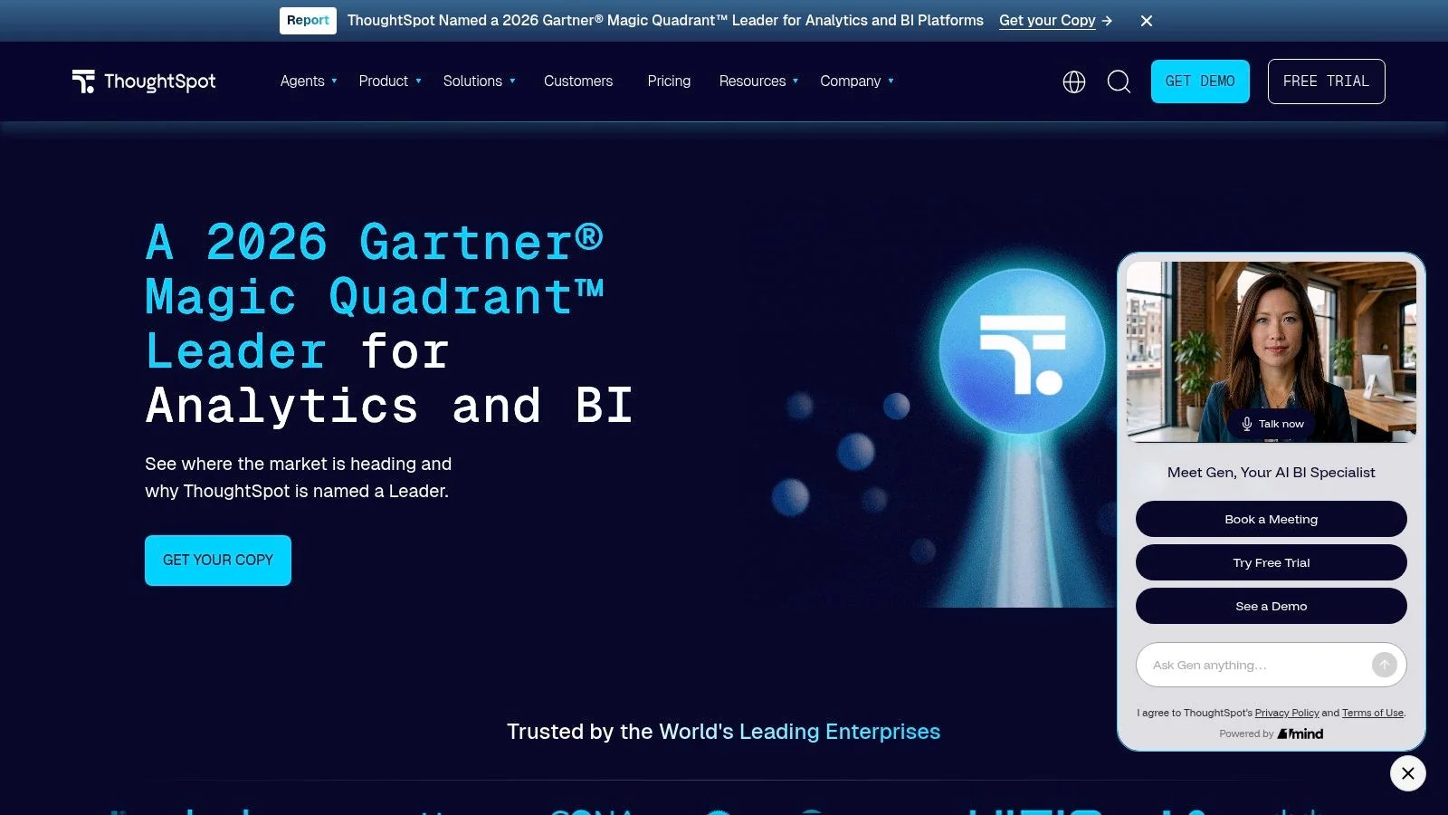
ThoughtSpot is the best pick when self-serve analytics has to feel fast for non-technical users. Search-first interaction, conversational analytics, and Liveboards give business teams a direct route to answers without heavy dashboard navigation.
That speed is useful on top of governed cloud data platforms. It works especially well when your data engineering team has already done the hard work in Snowflake, Databricks, or BigQuery and wants to expose trusted data broadly.
Best Use Case
ThoughtSpot shines in two scenarios. First, when executives and operators want search-driven access to governed data. Second, when you need embedded analytics inside products and customer-facing workflows.
Verified Liveboards are a practical governance feature because they let you distinguish trusted content from ad hoc exploration. That matters more than AI polish. Leaders need a clear line between certified metrics and user-generated analysis.
Its limitation is visual control. If your organization values carefully designed, highly formatted dashboards, Tableau remains stronger. ThoughtSpot wins when answer velocity matters more than layout precision.
6. Sigma Computing
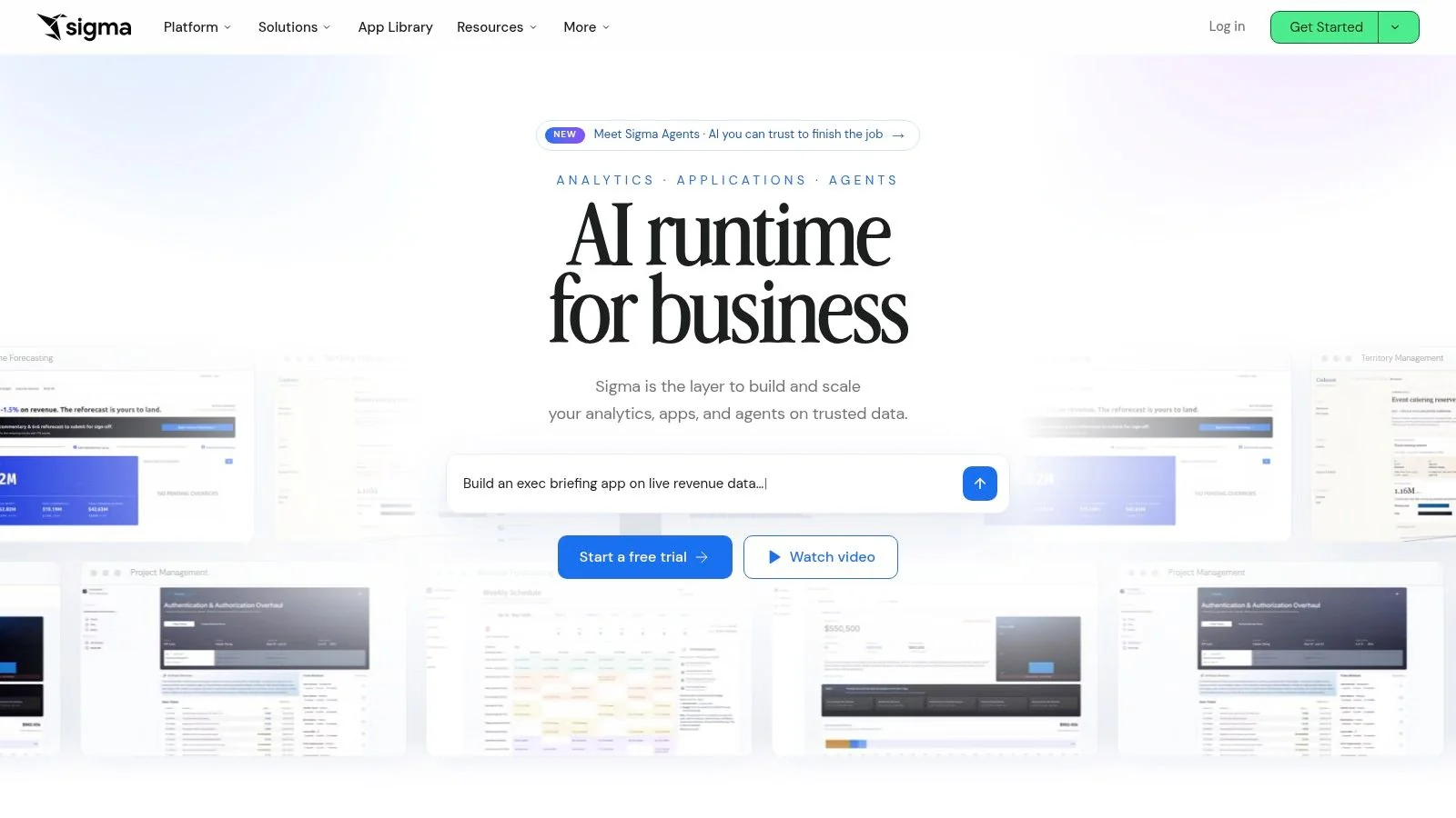
Sigma is the most pragmatic choice for cloud warehouse modernization. If your business users still think in spreadsheets but your platform strategy is Snowflake, Databricks, or BigQuery, Sigma closes that gap better than most BI tools.
Its core value is simple. Users work in a familiar workbook interface while queries run directly against the warehouse, not against exported extracts scattered across desktops.
Why Data Leaders Buy It
Sigma reduces one of the most common failures in BI modernization: moving data into a modern platform but leaving users stuck in old habits. It gives them spreadsheet-style modeling, pivots, joins, and reporting without pulling governed data out of the warehouse.
That has direct governance value. Fewer extracts means fewer shadow copies, fewer conflicting numbers, and less manual reconciliation between finance, operations, and analytics teams.
- Use Sigma when Excel habits are firmly embedded and you want live warehouse access without a brutal change-management program.
- Skip Sigma if visual design sophistication is the top requirement and workbook interaction isn’t central to the user experience.
For Snowflake and Databricks programs, Sigma often delivers the fastest path from platform investment to broad business adoption.
7. Grafana
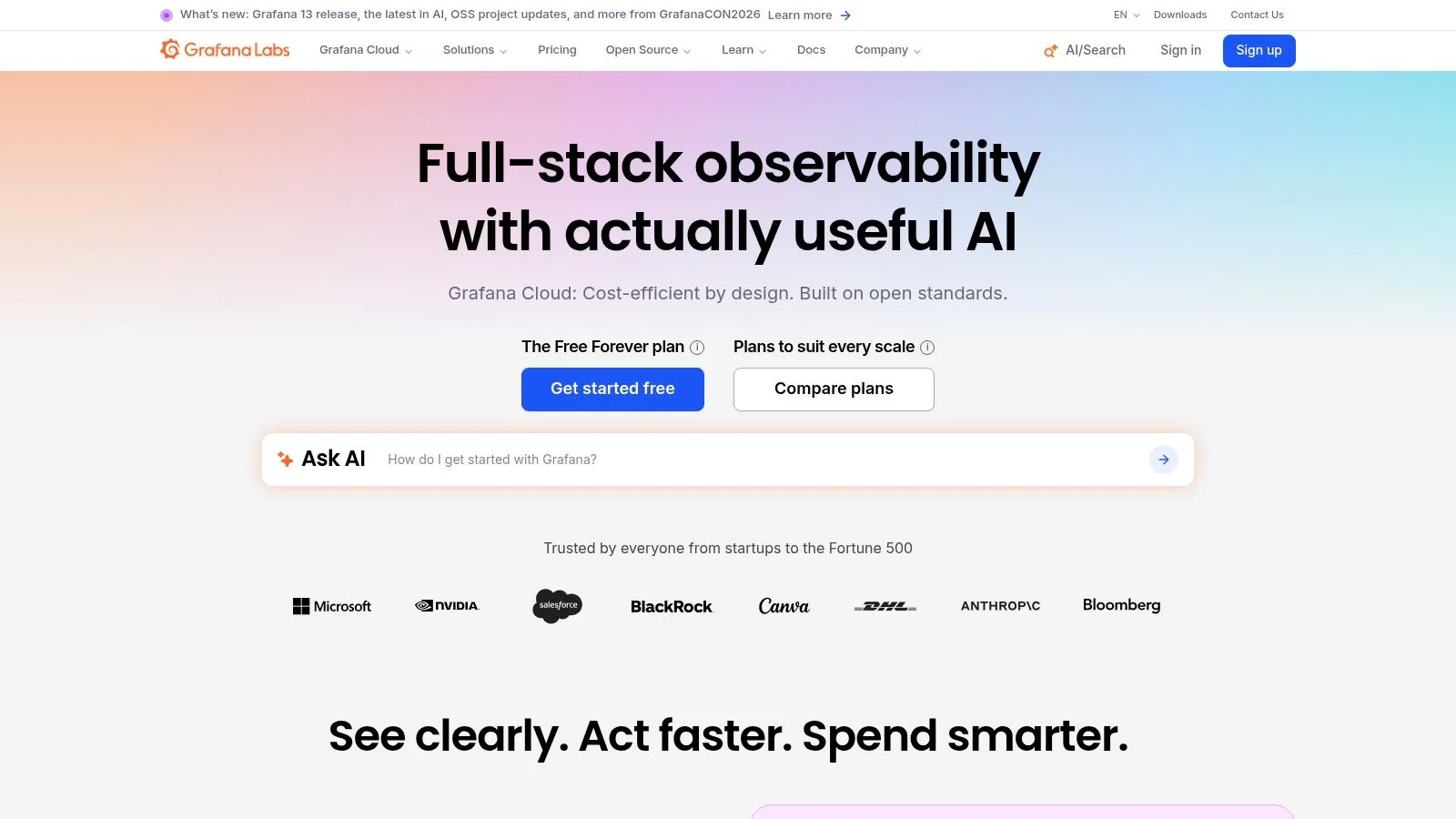
Grafana belongs on this list for one reason. Operational analytics is part of enterprise data strategy, and most BI suites still do it poorly.
If you need real-time, time-series, or infrastructure-adjacent dashboards, Grafana is usually the right tool. It supports a broad plugin ecosystem and works across SQL, Prometheus, Elasticsearch, and other data sources that engineering teams already operate.
Where It Fits
Grafana is best for platform telemetry, SLA dashboards, incident visibility, data pipeline monitoring, and near-real-time operational views. On top of a warehouse, it can serve tactical BI use cases, but that’s not its strongest lane.
It is not a semantic-model-first business intelligence platform. If finance, sales, or executive reporting needs governed business metrics, pair Grafana with a dedicated BI tool instead of forcing it to do both jobs.
Use Grafana for operational truth. Use another platform for business truth.
That separation keeps ownership clear. Engineering gets live monitoring and observability-style analytics. Business teams get governed reporting built on curated models.
8. Apache Superset
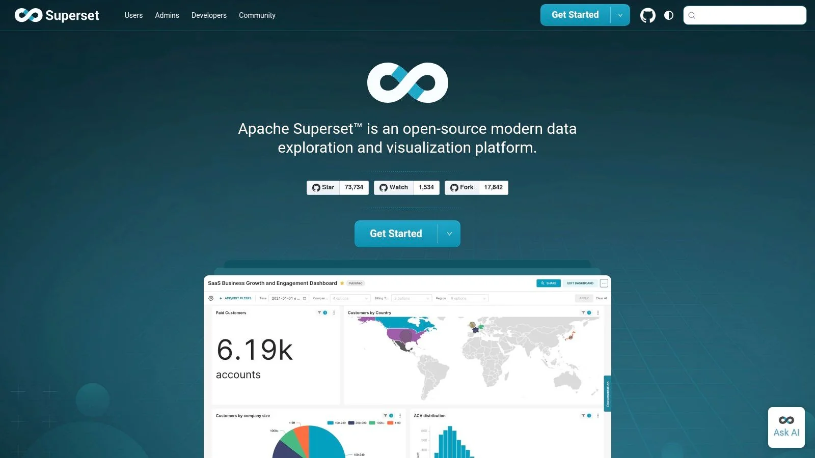
Apache Superset is the strongest open-source option for engineering-led organizations that want control over the BI stack. If your team already runs Airflow, dbt, Kubernetes, and internal platform services, Superset is a natural extension.
The biggest advantage isn’t feature novelty. It’s architectural ownership. You control deployment, security hardening, scaling patterns, and integration choices instead of inheriting a vendor’s opinionated SaaS model.
When It’s the Right Answer
Superset works well when the BI layer is part of a broader internal platform. It supports SQL-forward workflows, dashboards, charting, RBAC, and embedding, which makes it attractive for teams building internal analytics products.
The cost is operational burden. You don’t pay license fees, but you do pay in DevOps ownership, patching, authentication setup, and governance design. For some enterprises that’s a good trade. For others it’s an expensive distraction.
Choose Superset only if your engineering organization is prepared to treat BI as software infrastructure, not as a packaged application.
9. Mode
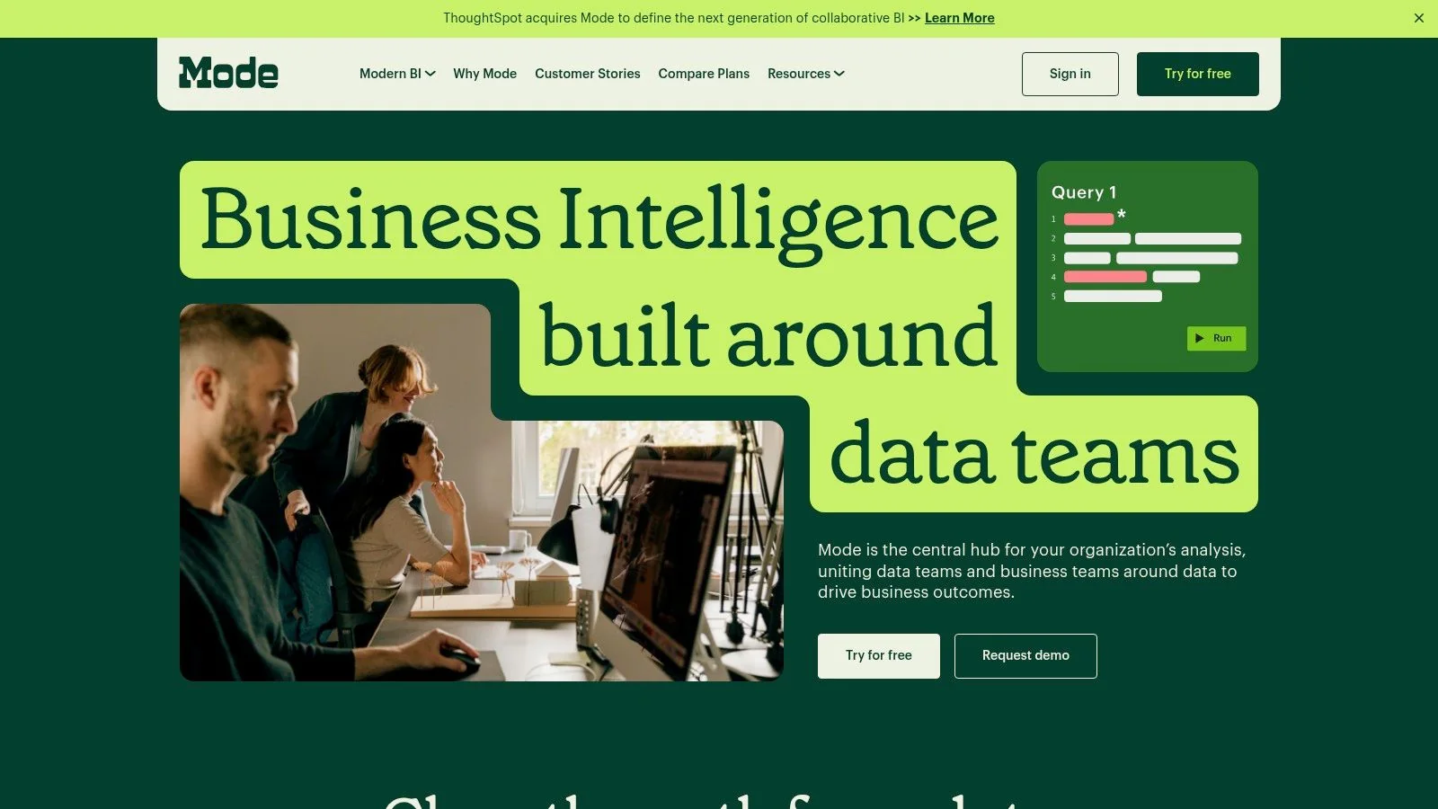
Mode is the analyst-first option. It’s the best fit when SQL, Python, R, and reporting need to live in one workspace and your analytics team doesn’t want context switching between notebooks and dashboards.
That makes it especially useful in organizations where advanced analytics and BI overlap heavily. Product analytics, growth analytics, experimentation, and data science-adjacent reporting teams usually get value from Mode quickly.
Why It Works
Mode removes handoffs. Analysts can query data, run notebook logic, visualize outputs, and share reports without moving through separate tools for each step.
That’s powerful in engineering-heavy companies with technically strong analytics teams. It’s less effective for broad self-serve rollouts where business users want more guided, no-code interaction.
If your analytics operating model centers on expert practitioners rather than mass business adoption, Mode is a strong choice. If the opposite is true, Sigma, Power BI, or ThoughtSpot usually fit better.
10. MicroStrategy ONE
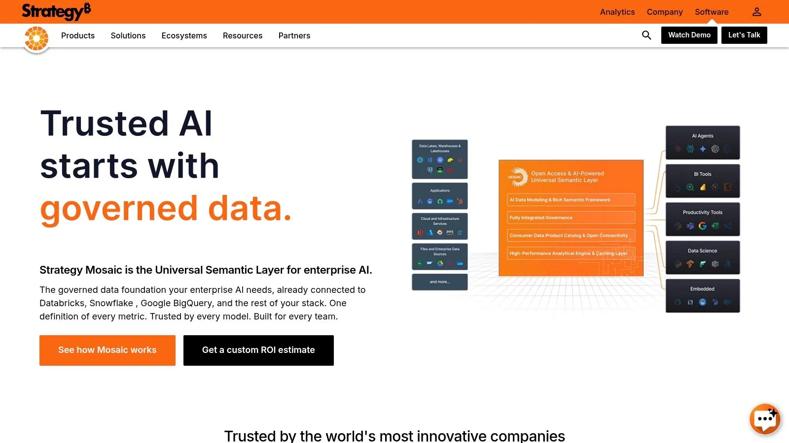
MicroStrategy ONE is built for large, highly governed deployments where security, administration, mobile delivery, and formal reporting matter as much as dashboard exploration. It remains a serious platform for regulated enterprises.
Its differentiator is control. HyperIntelligence cards, governed dossiers, pixel-perfect reports, and strong platform administration make it suitable for organizations that need analytics inside structured operational environments.
Enterprise Recommendation
If you run analytics in financial services, healthcare, or another tightly controlled environment, MicroStrategy deserves a place on the shortlist. It supports heavy governance and extensive administrative oversight better than lighter SaaS-first tools.
The tradeoff is implementation weight. It takes more planning, stronger platform ownership, and a clearer deployment model than tools optimized for quick self-serve growth.
MicroStrategy is the right answer when governance depth beats simplicity. It’s the wrong answer when your primary goal is rapid rollout with minimal platform administration.
Top 10 Data Visualization Software Comparison
| Product | Core strengths | Best for (target audience) | Integration & governance | Pricing & licensing |
|---|---|---|---|---|
| Microsoft Power BI | Enterprise BI, DAX models, Copilot AI, embedding | Microsoft-centric orgs, mixed self-serve + governed users | Tight Fabric/Azure/365 integration, strong RLS & admin controls | Per-user + Premium capacity; sharing often requires paid licenses |
| Tableau (Salesforce) | Best-in-class visual authoring, Prep, Pulse AI | Visual analysts, enterprise BI teams | Cloud & Server deployments, role-based licensing (Creator/Explorer/Viewer) | Per-user + add-ons; licensing can be complex |
| Qlik Sense | Associative Engine, in-platform AutoML, flexible blending | Exploratory analytics, power users needing fast discovery | SaaS or client-managed, broad connectors; governance setup can be complex | Capacity-based models; sizing required |
| Looker (Google Cloud) | LookML semantic layer, governed metrics, embeddability | Enterprises focused on metric governance and embedding, GCP shops | Deep Google Cloud integration, reusable semantic metrics | Quote-based pricing tied to instance/usage |
| ThoughtSpot | Natural-language search, AI answers, Liveboards, embedding | Non-technical users, product teams seeking embedded analytics | Governed search-driven access, verified Liveboards, strong embedding toolkit | Consumption / usage-based; monitor usage to avoid surprises |
| Sigma Computing | Spreadsheet UX on cloud warehouses, live queries | Excel-heavy business users on Snowflake/Databricks/BigQuery | Direct warehouse connectivity, governed self-serve, embedding | Quote-based enterprise pricing |
| Grafana | Time-series & real-time visualization, 150+ plugins | Observability/ops teams, real-time dashboards; also SQL use cases | OSS, Cloud, or Enterprise self-managed; plugin ecosystem; RBAC in paid tiers | OSS free; Cloud tiers (free/pro/enterprise) |
| Apache Superset (open source) | SQL-forward charts & dashboards, RBAC, embedding | Engineering-led teams wanting control and no-license cost | Modern deployment docs, RBAC, requires DevOps & security hardening | Free open-source; optional managed hosting costs |
| Mode | SQL + Python/R notebooks + visualizations, collaboration | Data teams combining analytics, notebooks and reporting | Tight notebook-to-report workflows, embedding & governance | Tiered per-user / quote-based for enterprise features |
| MicroStrategy ONE | Governed modeling, pixel-perfect reports, HyperIntelligence | Large regulated enterprises needing embedded KPIs & security | Robust admin, security, telemetry; generative AI assist | Quote-based enterprise pricing |
Framework: From Shortlist to Final Decision
Selecting the best data visualization software requires more than comparing feature lists. According to DataEngineeringCompanies.com’s analysis of 86 data engineering firms, integration friction with the primary data warehouse is the top reason BI projects fail to deliver ROI. That finding should shape your process from day one.
Start with the platform, not the demo. If Snowflake, Databricks, BigQuery, or Fabric is the center of your architecture, test every BI candidate against live governance, identity, and query patterns from that environment. Don’t let vendors define success with sample datasets and isolated workspaces.
Four filters that should decide the shortlist
- Platform alignment: Does the tool work cleanly with your warehouse or lakehouse, or does it push you toward extracts, duplicated semantic logic, or custom connector debt?
- Governance model: Can you enforce trusted metrics, access controls, and content certification without turning every dashboard change into an engineering queue?
- Scalability under real usage: Does the tool still perform when many users hit shared data products at once, especially on live warehouse queries?
- Total cost of ownership: Include licenses, admin overhead, embedded use cases, capacity planning, training, and the cost of rebuilding logic in multiple layers.
Shortlist tools that reduce semantic duplication. That one decision lowers governance risk more than almost any dashboard feature comparison.
For most enterprises, the decision path is clear. Choose Power BI for Microsoft-heavy environments. Choose Tableau when visual quality and enterprise flexibility are top priorities. Choose Looker when metric governance is the primary problem. Choose Sigma when warehouse modernization depends on replacing spreadsheet habits. Choose ThoughtSpot when broad self-serve search matters. Use Grafana for operational analytics, not executive BI.
Use these questions in your RFP process:
- How does the tool handle governed metrics across warehouses, notebooks, and dashboards?
- What breaks when concurrency rises and query volumes spike?
- Which admin tasks stay with your internal team after go-live?
- How much logic ends up inside the BI layer versus dbt or the platform model?
- What does secure embedding require in practice, not in product marketing?
For a complementary view on what strong dashboard design should still look like after the platform decision is made, review PlotStudio AI’s visualization insights.
The next step is simple. Run a proof of concept with production-grade data, real access controls, and a narrow set of business-critical dashboards. If a tool can’t survive your actual platform constraints, it doesn’t belong in your stack.
Researched & written by
Data-driven market researcher with 20+ years in market research and 10+ years helping software agencies and IT organizations make evidence-based decisions. Former market research analyst at Aviva Investors and Credit Suisse.
Previously: Aviva Investors · Credit Suisse · Brainhub · 100Signals
Vetted partners
Featured Data Engineering Partners
Vetted firms whose specialty matches this article.
Related Analysis
Practical Data Analytic Strategies That Drive Business Outcomes
Practical data analytic strategies for 2026: build a business-aligned analytics roadmap, choose the right tools, and turn raw data into measurable business outcomes.

What is a semantic layer? A Practical Guide for AI and BI Data Unification
Discover what is a semantic layer and how it unifies data for AI and BI, including Snowflake and Databricks.
Your Practical Guide to BI Consulting Services
Unlock your data's potential with BI consulting services. This guide covers costs, engagement models, vendor selection, and common red flags to avoid.